
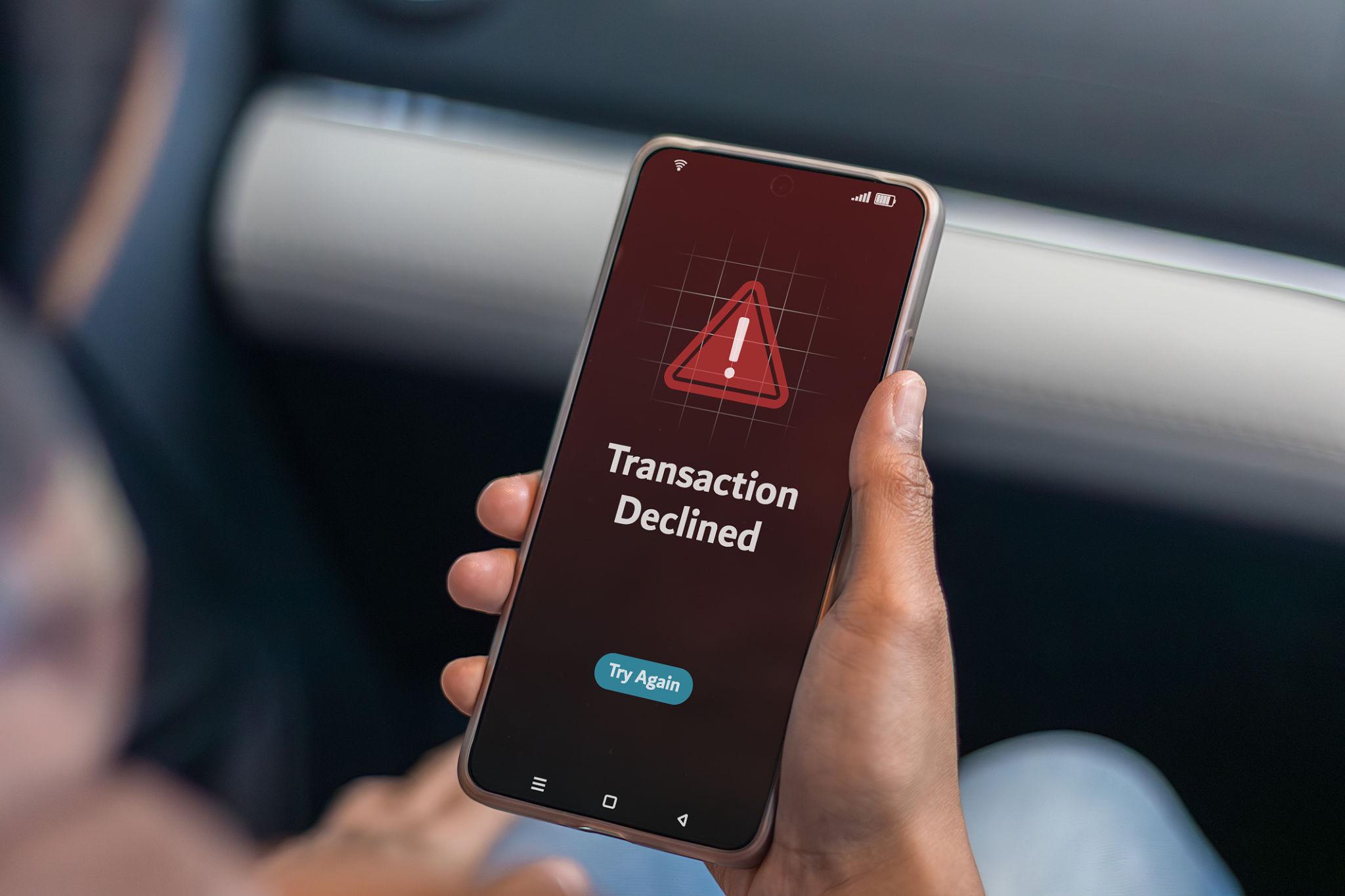
A card payment fails at a supermarket checkout and the banking app sends a notification: “Transaction declined.” Technically, the message is correct. Practically, it tells the customer almost nothing. Was there not enough money in the account? Did the bank block the payment? Was the card frozen? Did the merchant send something incorrectly? Should the customer try again, use another card or contact the bank?
For years, declined payments have created exactly this kind of uncertainty. Banks and card issuers often had far more information about a failed transaction than they exposed to the customer, leaving a generic error message to cover many completely different situations. Digital banking is gradually changing that experience. Instead of treating every decline as the same event, banking apps can increasingly turn payment failures into explanations with a reason, context and an appropriate next step. That may sound like a minor interface improvement. It is actually an important change in how financial apps communicate problems.
“Payment declined” describes the result, not the problem
A declined card transaction is an outcome. It does not explain why that outcome occurred, and that distinction matters when a customer is standing at a checkout or trying to complete an online purchase. There are numerous reasons why a card payment might not go through. Some can be resolved by the customer immediately, while others depend on the merchant, card issuer or payment infrastructure. Grouping all of them under one generic message forces users to guess what happened.
A failed payment could relate to insufficient available funds, an expired card, an incorrect security code, a spending limit, a frozen card, a security check or a restriction affecting a particular transaction type. Online and international transactions can introduce additional conditions. In other situations, the card itself may be perfectly usable and the failure may originate elsewhere in the payment chain. The useful question for a banking app is therefore no longer simply, “Did this transaction fail?” It is, “What can we safely tell the customer about why it failed and what should happen next?”
Different failures require different responses
A generic decline message often encourages the same behavior regardless of the actual problem: try the payment again. Sometimes that works. Sometimes it achieves nothing. If a card is temporarily frozen, repeating the transaction will not solve the issue until the customer unfreezes it. If the purchase exceeds a configurable card limit, retrying the exact same amount is unlikely to help. If the available balance is insufficient, the user needs to know which balance is relevant before making another attempt.
Clearer explanations allow the app to connect the reason with a useful action.
| Possible situation | More useful app response |
|---|---|
| Insufficient available funds | Show that available funds may be too low |
| Card is frozen | Provide access to card controls |
| Spending limit reached | Show the relevant limit or settings |
| Online payments disabled | Link to online payment controls |
| International use restricted | Show international card settings |
| Card expired | Identify the card status |
| Security check required | Explain the verification step |
| Unknown technical failure | Recommend waiting or using another method |
The value comes from specificity. The customer should not have to search through five different sections of an app to discover that a setting they control caused the decline.
Available balance can be more complicated than account balance
One of the most confusing payment situations occurs when the customer appears to have enough money. Someone might open a banking app, see $300 in the account and wonder why a $250 purchase failed. The explanation can lie in the difference between a displayed account balance and the amount currently available to spend.
Pending transactions, card authorizations and other holds can affect available funds. A hotel, fuel station or car rental company may also use authorization practices that temporarily reserve an amount rather than immediately completing a conventional purchase. From the customer’s perspective, the contradiction is obvious: “The app says I have money, but my payment was declined.”
A useful decline explanation should help connect those two pieces of information. Simply showing the main balance beside a failed transaction can make the situation more confusing if that number does not represent what was available for the attempted payment. Good banking interfaces increasingly need to explain not only the transaction but also the financial state surrounding it.
Card controls can accidentally block legitimate purchases
Modern banking apps give customers much more direct control over their cards. Users may be able to freeze a card instantly, restrict online purchases, manage contactless functionality or adjust certain spending settings. Those controls are useful until someone forgets that a restriction is active.
A person might disable online transactions after noticing suspicious activity and then, weeks later, try to pay for a subscription. Another user may freeze a card temporarily, forget about it and attempt a purchase in a physical store. A vague decline notification does not connect the failed transaction with the earlier decision.
A smarter app can. Instead of merely reporting that the purchase failed, the interface can recognize that a relevant card control may explain the result and take the customer directly to the setting. That shortens a troubleshooting process that might otherwise involve checking the balance, trying the payment again and eventually contacting support. The broader lesson is important: as financial apps give users more control, they also need to explain the consequences of those controls.
Spending limits need context when they cause a failure
Card limits create a similar problem. A customer may know that limits exist without remembering the exact amount or how much of the relevant allowance has already been used. When a purchase crosses that boundary, a generic decline message makes the failure appear arbitrary.
If the banking app can safely identify the applicable restriction, showing the relevant context turns the experience into something understandable. For example, the app might indicate that the attempted purchase exceeds a transaction limit and provide a route to the appropriate card settings where changes are permitted.
That is much more useful than presenting an unexplained red icon beside the transaction. There is also a UX advantage here. Users should not have to memorize financial settings that the app already knows. If a setting directly explains an event, the interface can bring those pieces of information together at the moment they become relevant.
Online payments introduce their own failure points
Paying online involves details that do not normally appear during a simple contactless purchase. Card number, expiration date and security information may be entered manually or stored by a merchant, while additional authentication can sometimes be required. That creates more opportunities for a transaction to fail before the customer understands what went wrong.
The useful response depends heavily on the stage of failure. An incorrect card detail is different from a security verification that was not completed, and both are different from a bank restriction on online purchases. This is why one generic “declined” label performs poorly in digital commerce. It collapses several different problems into the same message.
Banking apps cannot necessarily reveal every technical detail behind a transaction. Security, network rules and the information received from other participants in the payment chain can limit what is available. But when a meaningful explanation can be given, translating that information into ordinary language can save the customer considerable frustration.
International purchases make generic errors even less useful
A card that works normally at home can behave differently when used abroad or with an overseas merchant. Currency, merchant location, issuer controls and security systems can all influence the payment process. Customers often interpret an international decline as evidence that the card simply “doesn’t work abroad.” That may not be the real explanation.
The failure could be specific to a particular transaction, merchant or card setting. This is another area where contextual messaging helps. If the banking app knows that a relevant international restriction or security requirement is involved, the notification can guide the customer toward the appropriate action rather than encouraging repeated attempts.
For travelers especially, that information can be far more valuable than a generic failure message. A declined payment at home is inconvenient. The same unexplained decline in another country can quickly become stressful.
Repeated attempts are not always the right solution
One of the unintended effects of vague error messages is that users often keep trying. A payment fails, so they tap again. It fails again, so they insert the card. Then they try through a mobile wallet. Online, they might reload the checkout and submit the same purchase several times. Without knowing the cause, repetition feels reasonable.
A better explanation can interrupt that cycle. If the problem is a disabled card setting, the user can fix the setting first. If funds are unavailable, repeated attempts serve little purpose. If the issue appears temporary, the app can communicate that rather than leaving the customer to experiment.
This matters because failed payments are not isolated technical events from the user’s perspective. They happen during another task: buying groceries, booking travel, paying a bill or completing an online order. Every unnecessary retry adds friction to that task.
Some declines need explanation without exposing security systems
There is an obvious limit to transparency. Banks cannot simply reveal every internal signal used to assess transactions. Fraud detection and security controls depend partly on not exposing detailed decision logic that could help people circumvent them. This means the best decline message is not necessarily the most technically detailed one. There is a difference between useful transparency and revealing sensitive security information.
A banking app might communicate that a transaction was blocked for security reasons and provide a verification or support path without explaining exactly which internal rule triggered the decision. The customer receives enough information to understand that the problem is not simply a low balance, while the bank avoids exposing the mechanics of its risk systems.
A practical hierarchy looks something like this:
| Level | Example |
|---|---|
| Too vague | “Declined” |
| Better | “Payment couldn’t be completed” |
| Useful | “This payment may have been blocked by a card setting” |
| Actionable | “Online payments are currently disabled. Review card settings.” |
| Too revealing | Detailed internal fraud-detection logic |
The goal is not maximum disclosure. It is the right amount of explanation.
Failed payments are becoming part of transaction history
Historically, banking interfaces often emphasized completed transactions. Failed attempts could feel temporary, disappearing from the customer’s attention almost as quickly as they occurred. There is a strong argument for giving meaningful failed transactions a clearer place in the financial timeline.
If a customer tries to make a $120 purchase and it fails, that event can still matter even though no final charge was completed. Seeing the attempt alongside its status and explanation helps answer questions later, especially if the customer subsequently uses another payment method. It can also reduce confusion when several attempts occur close together.
The interface needs to distinguish these events carefully from completed charges. A failed attempt should never look like money was actually taken when it was not. Clear status labels, timestamps and explanatory text become important. Handled properly, the transaction history becomes a record of what happened rather than only a list of money that successfully moved.
Better explanations can reduce unnecessary support contacts
Consider the traditional troubleshooting path after a decline. The customer checks the balance, tries the purchase again, looks through card settings, searches a help center and may eventually contact customer support. Now compare that with a notification that immediately identifies a relevant card restriction and links directly to the setting. The second experience removes several steps.
This is useful for the customer, but it also has operational value for financial institutions. Many support questions are not complicated financial problems. They are information problems. The institution may already know enough to explain what happened; the information simply has not reached the customer in a useful form. Clear decline messaging can turn some of those interactions into self-service. Support remains essential when the cause cannot be resolved in the app, but it should not be the first destination for a problem the interface can already explain.
The best message changes according to the cause
There is no ideal universal decline message because the correct next step depends on the reason. A useful design can think in terms of three pieces of information:
What happened?
The attempted payment was not completed.
What is the likely reason that can safely be communicated?
For example, a card setting, available-funds issue or limit.
What can the customer do next?
Change a setting, check funds, complete verification, use another payment method or contact support.
That structure is simple enough for a mobile notification while still giving the customer substantially more information than “declined.” The full explanation does not necessarily need to fit into the notification itself. A short alert can open a detailed transaction screen containing the relevant context and actions. This keeps the notification readable without sacrificing usefulness.
Payment troubleshooting is becoming a product feature
The larger change is that banks are starting to treat payment problems as part of the product experience rather than something that belongs exclusively to customer support. That makes sense. Customers already use banking apps to freeze cards, view balances, track transactions and control spending. The same interface is the natural place to explain why a payment did not work.
A strong failed-payment experience can connect several existing banking features:
- transaction details;
- available balance;
- card status;
- spending controls;
- security verification;
- help and support;
- alternative payment options.
The pieces often already exist. The improvement comes from connecting them at the right moment.
A good banking app should answer the next question
Financial apps contain enormous amounts of information, but useful design is not about displaying all of it simultaneously. It is about predicting what information matters after a specific event. After a salary arrives, the user may want to know what is available to spend. After a refund, they may want to know when it will become available. After a failed card payment, the immediate question is obvious: why?
“Transaction declined” answers only what happened. The next generation of payment messaging is more useful because it attempts to answer what comes after that: why the transaction failed, whether the customer can fix it and what action makes sense now. That small change turns a banking app from a passive transaction record into a troubleshooting tool. And for something as common and frustrating as a failed card payment, a clear explanation can be worth far more than another new dashboard or financial chart.
