
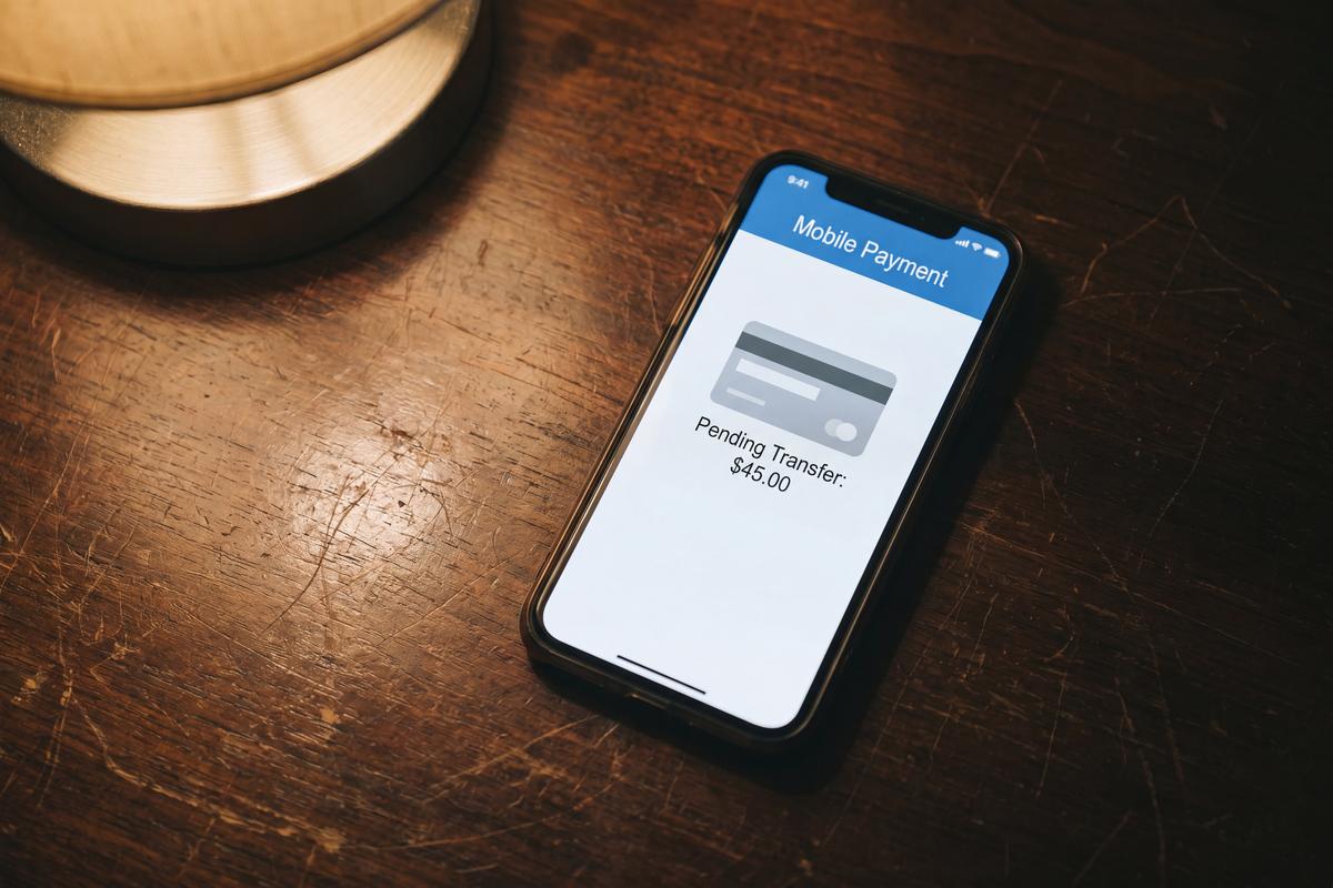
A card payment can appear in a banking app seconds after a purchase and still not be a finished transaction. The balance may already have changed, the merchant may be visible and the amount may look final, yet the payment can remain marked as “pending” for hours or days. That small status creates a surprisingly large amount of confusion.
Users naturally expect a transaction shown in their banking history to represent money that has definitively moved. Card payments do not always work that way. Authorization, temporary holds, final settlement and merchant adjustments can create a gap between what appears immediately and what eventually posts to the account. Banking apps are becoming better at explaining that gap rather than leaving a small “pending” label to do all the work.
A pending payment is not simply a slower transaction
From the user’s perspective, paying by card feels almost instant. Tap the card, see an approval message and continue with the day. Behind that simple interaction, the payment still has stages to complete. When a card purchase is authorized, the bank can reserve the relevant amount so it is no longer freely available for other spending. The transaction may then remain pending until the merchant completes the process and the payment posts.
This distinction explains a common banking-app situation:
Current balance: $1,200
Pending card payment: $85
Available to spend: $1,115
A user looking only at the first figure might reasonably assume that the full $1,200 remains available. Showing the relationship between pending payments and available funds makes the account easier to understand.
The word “pending” leaves too many questions unanswered
A status label identifies the transaction stage but rarely explains what the user actually wants to know.
Someone seeing a pending $70 restaurant charge may wonder:
- Has the merchant already received the money?
- Can the payment still disappear?
- Why is the amount different from the receipt?
- Why has it been pending for two days?
- Can the merchant charge it again?
- Is the money included in the available balance?
- Should the user contact the bank?
A useful transaction screen can answer several of these questions without requiring a support conversation.
Instead of displaying only:
Pending
the app can provide context such as:
Card payment authorized
The amount is temporarily reserved and may change when the merchant completes the transaction. That extra sentence can prevent a routine part of card processing from looking like an account problem.
Temporary holds make some transactions especially confusing
Not every merchant knows the final transaction amount at the moment a card is presented. Hotels are an obvious example. A property may authorize an amount when the guest checks in and complete the final charge later. Car rental companies can also place holds because the eventual total depends on the rental period and additional charges.
Fuel stations can create a similar experience when pay-at-pump systems authorize funds before the final amount of fuel is known. Restaurants introduce another variation in markets where tips may be added after the initial authorization. The result is that the amount first shown by the banking app does not always match the final posted transaction.
| Transaction type | Why the pending amount may differ |
|---|---|
| Hotel | Deposit or incidental hold |
| Car rental | Temporary authorization |
| Fuel station | Preauthorization before final purchase |
| Restaurant | Tip added after initial authorization |
| Online order | Final amount captured when goods ship |
Without context, users can interpret these differences as duplicate charges or incorrect payments. A banking app that recognizes the situation can explain it before concern turns into a dispute.
Available balance needs more attention than ever
Modern banking apps display more financial information than traditional account statements did. That creates an opportunity to distinguish clearly between money recorded in the account and money actually available for immediate spending. Pending transactions make this distinction important.
Imagine someone has $500 in an account and makes three card purchases worth $40, $90 and $120. All three are authorized but remain pending. The account may still show information that reflects the underlying ledger differently from the amount currently available to spend. A well-designed app should make the practical answer obvious.
Instead of forcing the user to calculate:
$500 − $40 − $90 − $120
the interface can prominently show the available amount after relevant holds. This becomes particularly useful when several pending transactions accumulate during travel, weekends or periods of heavy spending.
Pending amounts can change without a second purchase
One of the strangest experiences for users occurs when a pending amount changes. A restaurant transaction might initially appear at one value and later post at another. A temporary hotel authorization can disappear and be replaced by the final bill. A merchant may also cancel an authorization that never becomes a completed transaction. From a technical perspective, these events are different from simply charging the card twice. From the user’s perspective, they can look almost identical.
This is where transaction history design matters. If an app simply removes the original pending item and introduces another amount later, the user has to reconstruct what happened. If it preserves enough context to connect the authorization with the final transaction, the sequence becomes much easier to follow. The banking timeline starts behaving like a history of the payment rather than a static list of amounts.
A transaction can disappear from pending status
Another confusing situation occurs when a pending payment vanishes. Users sometimes assume that disappearing means the purchase has been cancelled permanently. That may be true in some cases, but an expired or released authorization does not necessarily tell the whole story of what the merchant will eventually do.
The app needs careful wording here. Overconfident messages can be just as problematic as vague ones. If the banking interface cannot know what the merchant will do next, it should explain what has happened without promising an outcome it cannot guarantee.
For example, distinguishing between:
Authorization released
and:
Payment cancelled
can matter.
The first describes what happened to the hold. The second makes a broader claim about the purchase itself. Small wording differences can dramatically improve financial clarity.
Pending payments should not look identical to completed payments
Visual hierarchy can help users understand transaction state before they even open the details. Completed card payments might use the normal transaction presentation, while pending items can receive a visible status, lighter treatment or a separate section. The exact design matters less than making the distinction consistent.
Users should be able to answer three questions quickly:
- Which payments are complete?
- Which payments are still pending?
- How much money is actually available?
If the interface requires opening every transaction individually, the account overview is not doing enough. At the same time, pending payments should not be hidden. They affect spending decisions even though they have not completed settlement. The design challenge is to show that they matter without presenting them as final.
Better merchant information makes pending status easier to understand
A pending transaction becomes even more confusing when the merchant name is unclear. A user who sees “XYZHOLDINGS 4837” beside a temporary $100 authorization has two mysteries to solve: what company created the transaction and why the payment has not posted. Improved merchant recognition helps solve the first problem. Better pending-payment explanations solve the second.
Together, they can turn an unfamiliar transaction into something recognizable:
Central City Hotel
$100.00
Pending authorization
Temporary hold placed during check-in
The user immediately has more context than a raw statement descriptor could provide. This is an example of several banking-app improvements working together rather than existing as isolated features.
Estimated timing can help, but it needs careful wording
Naturally, users want to know when a pending transaction will finish. Providing an exact countdown is difficult because the bank does not control every stage of merchant processing. Different merchants and transaction types can follow different timelines. That does not make timing information useless.
Apps can explain that most transactions complete within a typical period while making clear that exceptions exist. For certain transaction types, they can also explain why a hold may remain longer. The goal is not to predict settlement perfectly. It is to help users distinguish a normal delay from a situation worth investigating. A message such as “Most card payments complete within a few days” gives more context than an indefinite pending label, provided the app does not present the estimate as a guarantee.
Clearer pending states can reduce unnecessary disputes
When a transaction looks wrong, disputing it can feel like the safest response. But some apparent problems are simply unfinished payment processes. A hotel hold may look like an additional charge. A changed restaurant amount may look suspicious. A transaction that appears twice temporarily may cause concern before the records settle into their final form.
Better explanations can encourage users to understand the current state before choosing the next action. That does not mean discouraging legitimate disputes. If a transaction is genuinely unauthorized, users need a clear route to report it. The objective is different: help people distinguish between an unfamiliar or unfinished transaction and one that genuinely requires intervention.
Banking apps are turning transaction lists into payment timelines
Traditional bank statements were records of completed financial activity. Mobile banking apps increasingly operate in real time, which means they show events before those events are completely finished. That changes what users expect from the interface.
A modern transaction can move through several visible states:
Authorized → Pending → Adjusted → Completed
or:
Authorized → Pending → Hold released
Simply listing each event without connecting them can create more information without creating more understanding. The stronger approach is to present the payment as a sequence. Users can see what happened first, what changed and where the transaction stands now. This timeline model is especially useful for complex card payments because it mirrors the way users already think about deliveries, refunds and money transfers: as processes with identifiable stages.
Better explanations create more confidence than another dashboard
Digital banking has spent years adding charts, categories, forecasts and personalized financial insights. Those features can be valuable, but everyday confidence often depends on much smaller interactions. A person opening an app after noticing an unfamiliar pending charge does not necessarily need another spending graph. They need to understand what is happening to their money.
That is why pending transaction design deserves more attention. Showing the merchant clearly, separating authorization from settlement, explaining temporary holds and connecting pending activity with the available balance can remove uncertainty from one of the most common banking experiences. The payment system itself may remain complex. The interface does not have to feel that way.
