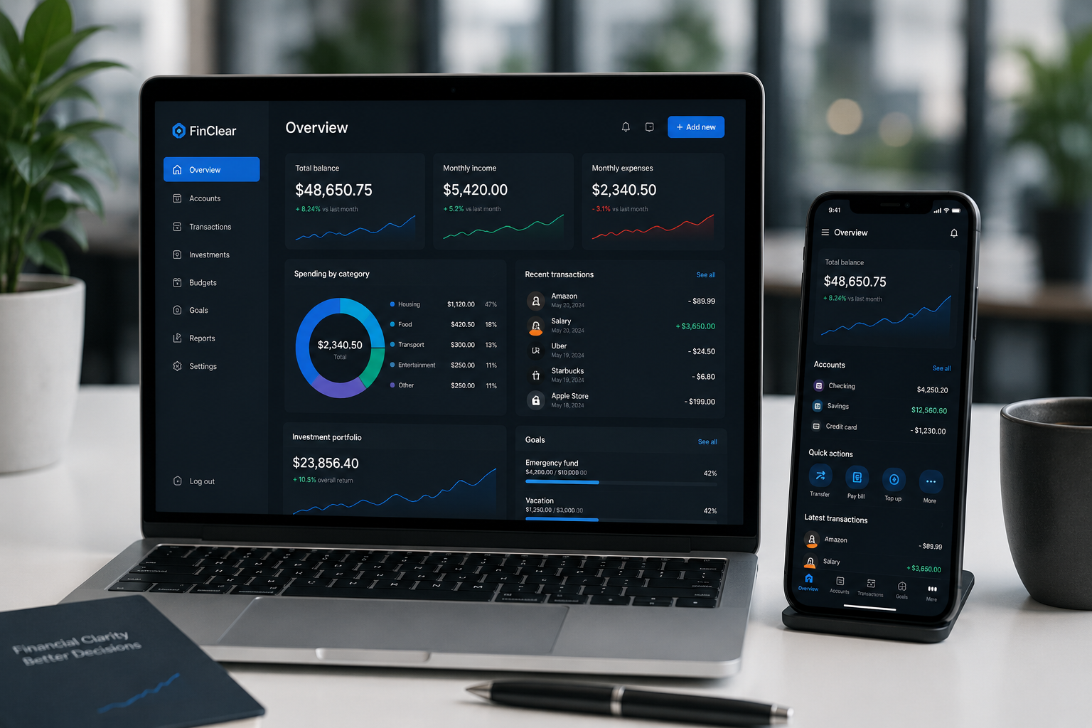
Modern financial platforms look very different compared to older banking systems.
Years ago, financial dashboards were often overloaded with menus, technical charts, dense tables, and complicated navigation. Today, many platforms intentionally reduce visual clutter and focus on cleaner interfaces.
This shift is not only about aesthetics. Simpler dashboards actually improve how users interact with financial information.
Too Much Information Creates Fatigue
Financial platforms deal with sensitive decisions involving money, investing, budgeting, and payments. When interfaces become visually overwhelming, users often feel confused or mentally exhausted.
Modern fintech companies realized that reducing unnecessary interface elements helps users make decisions faster and with more confidence.
Minimal layouts can sometimes improve usability more than adding new features.
Users Prefer Faster Understanding
Most people no longer want to spend time learning complicated systems. They expect dashboards to communicate important information instantly.
That is why modern financial interfaces often prioritize:
- large balance displays
- clean transaction history
- simple navigation menus
- quick-access buttons
- minimal visual distractions
Mobile Usage Changed Dashboard Design
The growth of smartphone banking strongly influenced interface simplicity. Financial dashboards now need to function efficiently on smaller screens where space is limited.
Complicated desktop-style layouts often perform poorly on mobile devices. As a result, many platforms redesigned their entire structure around mobile-first interaction.
Clean Interfaces Increase User Confidence
Visual clarity also affects trust.
Platforms with organized layouts and predictable navigation often feel safer and more professional to users handling financial activity online.
In contrast, chaotic interfaces may create unnecessary stress during transactions or investment decisions.
| Older Dashboards | Modern Dashboards |
|---|---|
| Dense information | Focused summaries |
| Complex navigation | Quick-access menus |
| Desktop-first design | Mobile-first layouts |
| Technical appearance | User-friendly experience |
Design Now Supports Behavior
Modern financial UX design focuses heavily on behavior patterns. Platforms analyze how users interact with balances, spending insights, notifications, and investment tools.
Instead of forcing users to adapt to complicated systems, interfaces are increasingly designed around natural digital habits.
Simplicity Does Not Mean Less Functionality
Many modern platforms still contain advanced tools and detailed analytics. The difference is that these features are presented more gradually and intuitively.
Good design hides complexity until the user actually needs it.
Conclusion
Financial dashboards became simpler because users expect faster, clearer, and more comfortable digital experiences.
As fintech platforms continue evolving, interface clarity and usability are becoming just as important as the financial services themselves.